Avatar & Signatures Shop

|The Brightest Witch's Wandworks#1|7Sept/lastupdt/QH,Alvida,DYM,BD-140 - Page 46

Created

Last reply

Replies

946

Views

86483

Users

112

Likes

1842

Frequent Posters

-krazyriya- thumbnail
Posted: 9 years ago
Hey! Amazingg update :D

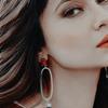
first four icons(ZGH)... i loved the coloured icons more..well cropped n coloured <3

http://i.imgur.com/Zucdkg4.png >>this is so pretty <3

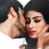
http://i.imgur.com/cMioP4m.png >>the colouring is fabb... <3
i really wish I could get this colouring too! :(

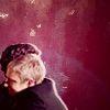
http://i.imgur.com/wReWMqa.png >> this is some of your finest works! i love siggies you do with this style! Its magnificent! <3

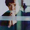
HH picspam is classy...GORGEOUS indeed <3 as u knw i love HH too <3

Superb work..keep it up! :)

-Varsha!


saher_90 thumbnail
Anniversary 16 Thumbnail Group Promotion 8 Thumbnail + 4
Posted: 9 years ago
YOUR work Is truly a CLASS . ⭐️

PERIOD. Edited by saher_90 - 9 years ago
..Razia.. thumbnail
Anniversary 11 Thumbnail Group Promotion 6 Thumbnail + 4
Posted: 9 years ago
First of all , a Happy New year πŸ€—
Hope 2015 is double the amazing for u as 2014
Was 😳 !

And this update is truly fab πŸ‘
Loved everything , but the styles u do
Is just amazing
Great job u are just full of talent πŸ€—β€οΈ


---
Oh yeah it's kinda like a suggestion πŸ˜†
So can u make a icon set siggy on these pics
Of zarry from 1D πŸ€—sorry cause some
Pics got repeated in the album so
Ignore that plz πŸ€—


http://m.imgur.com/a/dmbQW
amidstthehues thumbnail
Anniversary 9 Thumbnail Group Promotion 2 Thumbnail Engager 1 Thumbnail
Posted: 9 years ago
Page 62. 

http://i.imgur.com/UzZMbWs.png 
http://i.imgur.com/ZfYCABe.png
Cropping in all misc icons is very well, but that's no news. These two, however, I find best among the lot. Blues and whites have brought fine contrast, without going overboard. Look awesome, these. 

In DeadDevil's suggestion, I like top right one the most. Different green and all. 

You experiment picspams and other graphic styles of varying canvas size, keep up. Following are what I liked most in non-icons. 

http://i.imgur.com/pD6aGSl.png This. The 3D shift that gives sharp detailing. Cropping, style and colors. Saying single words and being ridiculous. But , yeah, cropping, style and colors. 

http://i.imgur.com/KfAiyFz.png Colors. Borders. Style. Size. That bokeh dot. Text style. Everything just fits. This one's such a complete package. Really, really, fine. 

http://i.imgur.com/2o6SOol.png I like texture play in this and how darkness doesn't overshadow his white collar. I've seen people going overboard with gradients/textures and missing little detailing that brings clarity and 
refinement. I really appreciate you spared his collar. :D (Y) 

http://i.imgur.com/U9cjlz6.png  This is awesome. Iski style bhi brill, iske colors bhi brill, contrast play and detailing bhi brill. 

http://i.imgur.com/umCGsAD.png That's pretty way of combining 15 pics to bring out certain meaning. Hues are beautiful. 

Page 69. 

http://i.imgur.com/90fdK3B.png
http://i.imgur.com/w4Q8B6W.png
These two, Sanam the bride, Humsafar, 6 LOTR ones. All of them are beauties. Your icon making skills don't need any glamorous texture overlays to look appealing. Besides, they are consistently awesome. 

Now the favourites,

http://i.imgur.com/p3gWWAn.png This for its simplicity and clarity. 

http://i.imgur.com/cMioP4m.png This for cropping, placement and one pixel something gaps. 

http://i.imgur.com/4fRT5nE.png This for the cleanliness and efforts. 

http://i.imgur.com/7u9Nlqg.png This for color texture combo that gives it detailing and depth. 

http://i.imgur.com/GmEWXsw.png The execution. Everything associated.

http://i.imgur.com/jbQxTgU.png Style. Merging. Colors and size. The texture too. It has come out visually appealing. Place and space given to each pic. All little big nuances that make it meaningful, basically. It's B/W counterpart posted is also awesome. 

http://i.imgur.com/k85v2Ou.png Particularly the chosen background. 

You have a defined style that's yours now. I associate and often recognise your work by it, without seeing Wandworks'. Keep up, woman. 

Ciao. 


GilrinTheGold thumbnail
Anniversary 10 Thumbnail Group Promotion 2 Thumbnail
Posted: 9 years ago
The Kili/Tauriel stuff is mind blowing. Definitely using some. Lovely Job! πŸ˜³
Sehr_VruShan thumbnail
Anniversary 10 Thumbnail Group Promotion 5 Thumbnail + 3
Posted: 9 years ago
Woww!! Amazing Update Dear πŸ‘
Loved each and everything specially IshRa, Saname Saeed and Asher and Khirad stuff the most 😳
Keep up the good work Dear

Aichuu001 thumbnail
Networker 1 Thumbnail
Posted: 9 years ago
husna wow girl everything luks stunning
the zgh icons wow
nisha-viraj the cropping of pic are amazing
hp stuff i dnt ship harry hermione but i like their unique friendship πŸ˜³ i loved the picture selection plus the colouring
Lord of rings signys are the highlight of this update 
Everything else luks stunning keep them coming  πŸ‘
reflections. thumbnail
Anniversary 11 Thumbnail Group Promotion 3 Thumbnail + 2
Posted: 9 years ago
Hello there!
The ZGH/Kashaf icons are flawless woman. Oh, who am I kidding, they're super classy. The coloring, textures used and the styles are so cool. 

The NAUC signature is really good. The color combination works.

      
^^ Prettiest, IMO.

All the Humsafar stuff are flawless. The pictures are so beautiful and your top notch work just added to it's beauty. πŸ˜³

^^ Normally I don't like dark colorings but man is this pretty! Gorgeous, actually. And the texture works perfectly with it.

https://i.imgur.com/elvRcLf.png << Why is this a disaster? The coloring is nice, texture is nice and moreover, the blending is superb! Problem kya hai? πŸ˜†

https://i.imgur.com/4fRT5nE.png << BEST.ONE.EVER. The best one I've seen on them. It's so.. no words could describe the perfection and the awesomeness on this one.

^^ This is so good. Like, tooo good to be able to describe in words. The brownish tinge is so dreamy. 

The Harry-Hermione signatures are perfection. All the way. 

https://i.imgur.com/k85v2Ou.png << WHAT. THE. πŸ˜²

https://i.imgur.com/Ftcbr6E.png << Could this BE anymore perfect?! The blending is worth a special mention tho.

Happy new year, woman and see you!
reflections. thumbnail
Anniversary 11 Thumbnail Group Promotion 3 Thumbnail + 2
Posted: 9 years ago
The update on page 62 ---
        
My favourites in the bunch. 

https://i.imgur.com/4j0Rp6C.png << This is absolutely astounding. Huma looks quite pretty in the song and you've made her look prettier, I daresay.

SRK-Kajol signature is awesome. I love the coloring and the texture. It's super pretty.

YHM stuff is flawless. You've got to work a little on the fonts department but otherwise, FLAWLESS.

The Deathly Hallows and the H&H signatures are a blend of perfection and classiness.

The request is so damn gorgeous. πŸ˜³

I hope I've not missed anymore updates. Phew. I am tired. πŸ˜†
thegameison thumbnail
Anniversary 13 Thumbnail Group Promotion 6 Thumbnail + 4
Posted: 9 years ago
Oh my lord, when did this happen? πŸ˜³