Finally am back, and I missed this place.
Husna, cool intro, well you have a blend of moods, or whats the fun? PS virus affects u badly, am glad to see u r using the software more though/
The zgh icons look great, just the pics merged with bg, is a task in small size, u did it v well, in 1st 3. The 4th looks bit rough and is prominenetly seen cos of light bg. The col is great nonetheless and texture usage/
Nisha, I really feel col and text style could have been better, so u cud hav improvised/
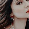
Sanam icons look pretty, crop and col, dreamy feel, well done/ and congo to her/
Now the Humsafar stuff is magical, and I enjoyed the show, saw recently when it was showed again, I liked it more than zgh.
Fab caps chosen, and the icons look marvellous, like can just stare I will b using soon...they r cropped precisely with a magical colouring, enhancing yellows and pinks perfectly and topped with the right texture. I feel 5th one, style cud have been better, u cud have given black border on top too, like bottom, just a sugg/
The 1st signature is fantastic, your best till date, a proper sig, blending is perfection, u hav gone to a new level, and text and textures, r wow, col too..I guess for sets u kept same col.
I even like the next sig/
Yhm stuff looks pretty, try std size icons, too, sometimes they hav the charm. 2nd set, I like dark col, but few became too red, but each has a prefrence I guess, but well textured.
http://i.imgur.com/4fRT5nE.png
This is hjklon...ultra ultra ultra fabulously marvellous!! Your hardwork shows, its done so precisely and perfectly, geometrically so right, omg/ The concept is so unique, like nature pics with the scene, goes so well, cos most times combo can b wrong, but this is perfect/ I love it, and col and all looks good, its secondary tbh. Bcos of these unique concepts, I always feel u inspire me in icon making with new style, pyramid, now this/
Spn stuff is cool, 2nd sig I feel that texture looks odd, as vertical ray/
Hp 1st is overdone/ 2nd is superb/
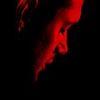
Lotr, bw sig is superb, col doesnt look, cos texture in bg is mismatch/
Set looks great , I love dark though many wl feel too dark, lol.
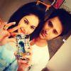
All requests look great, and well done, u have nailed blending in Kankshita's sig and Ankita's/ both r well done and textured/
Pri's the col is great and placement of pics, and 1st sig style itself is/
Love
Madhura/


comment:
p_commentcount